
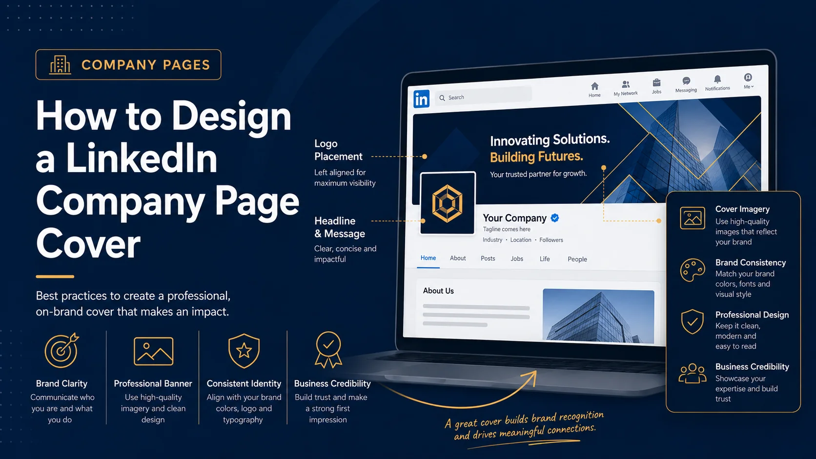
Your LinkedIn Company Page cover is one of the most important visual areas on your business profile. It appears at the top of the page and helps shape the first impression for potential clients, job candidates, partners, employees, and people discovering your brand for the first time.
A strong company page cover should not be treated like decoration. It should work as a small brand billboard. It can explain what your business does, show your positioning, promote a campaign, support hiring, or make your company look more credible.
The challenge is that many businesses either leave this space underused or fill it with too much information. A professional LinkedIn Company Page cover needs balance. It should be branded, clean, readable, and designed for different screen sizes.
Understand the Purpose of Your Company Page Cover
Before you open a design tool, decide what the cover needs to achieve. A LinkedIn Company Page cover can serve different goals depending on your business stage and marketing plan.
Your cover may need to:
- Introduce your company clearly
- Show your main service or product category
- Build trust with a professional brand image
- Support a hiring campaign
- Promote a webinar, event, launch, or offer
- Show your industry focus
- Highlight your company culture
The mistake is trying to achieve all of these goals at once. One LinkedIn cover image should usually focus on one main message. If you have a new campaign later, you can update the banner again.
Use the Correct LinkedIn Company Page Cover Size
LinkedIn recommends 4200 x 700 pixels for Page cover images. It also recommends PNG or JPEG files with a maximum file size of 3MB for LinkedIn Page and Career Page images. LinkedIn notes that cover images may be adjusted to fit different screens, which can trim the image horizontally or vertically. It also recommends placing key details away from the edges and keeping important content toward the center area.
This means your design should not only be the right size. It should also be designed with safe spacing. Avoid placing important text, logos, or calls to action in risky corners. Keep the main message clear and central enough to remain visible on different devices.
Start With a Strong Brand Message
The best company page covers usually communicate one strong idea. Visitors should be able to understand your business quickly without reading a long paragraph.
Examples of strong company page cover messages include:
- Helping Businesses Build Better Digital Experiences
- Reliable IT Support for Growing Companies
- Custom Software Solutions for Modern Teams
- Marketing Strategy, Branding, and Lead Generation
- Now Hiring Customer Support Professionals
These messages are short, clear, and business focused. They tell the visitor what the company is about without making the design feel crowded.
Keep the Layout Clean
A LinkedIn Company Page cover has a wide horizontal layout. This gives you room to create a strong design, but it also makes clutter easy. If you add too many elements, the banner can quickly become hard to read.
A clean layout may include:
- Your main headline
- A short supporting line
- Your logo or brand mark
- One simple call to action
- A professional background image or abstract design
You do not need to include your full address, every service, every award, all social icons, and multiple paragraphs. Your company page has other sections for detailed information. The cover should create a strong first impression and guide visitors into the rest of the page.
Use Brand Colors and Typography
Your LinkedIn Company Page should feel connected to your website, sales materials, proposals, and other brand assets. Using the same colors, logo style, and typography helps create consistency.
If your website is navy, white, and gold, your LinkedIn banner should use a similar visual direction. If your company brand is bright, modern, and playful, the cover should reflect that. If your business serves corporate clients, a cleaner and more premium style may work better.
Typography is also important. Use fonts that are easy to read. Avoid tiny text, overly decorative fonts, and low contrast. A company page cover should feel professional before it feels artistic.
Choose the Right Background Style
The background can be a photo, gradient, abstract pattern, office image, product visual, city skyline, technology design, team photo, or simple branded shape. The right background depends on your company and audience.
For example, a technology company may use subtle circuit lines, data visuals, software interface elements, or modern gradients. A real estate company may use city architecture or property visuals. A consulting firm may use a clean abstract design that feels premium and trustworthy. A hiring campaign may use real team or culture photos.
Whatever background you choose, make sure the text remains readable. If the image is busy, use an overlay, dark gradient, or solid text area to improve contrast.
Highlight Your Business Value
A good company page cover should help visitors understand what value your business provides. Instead of using a vague phrase like “Welcome to Our Page,” use a message that explains what you do or who you help.
For example:
- Instead of “Welcome to ABC Solutions,” use “Helping Healthcare Teams Improve Patient Scheduling.”
- Instead of “Quality Services Since 2015,” use “24/7 Dispatch Support for Transportation Companies.”
- Instead of “We Are a Digital Agency,” use “SEO, Web Design, and Lead Generation for Local Businesses.”
Specific messages are stronger because they help the right audience understand your offer quickly.
Add a CTA When It Makes Sense
A call to action can make your cover more useful. If your company page is part of a lead generation strategy, a short CTA may help visitors know what to do next.
Good LinkedIn company page cover CTAs include:
- Visit our website
- Book a consultation
- Explore our services
- Join our team
- Download the guide
- Register for the webinar
Keep the CTA short and visually secondary. The main headline should still be the most important element.
Design for Hiring and Employer Branding
If your company uses LinkedIn for hiring, your cover image can support employer branding. Instead of only promoting services, you can highlight company culture, team values, benefits, or open roles.
Examples include:
- We’re Hiring Remote Customer Support Specialists
- Build Your Career With a Growing Technology Team
- Join a Team Focused on Innovation and Client Success
For hiring-focused covers, real team photos or culture-based visuals can work well. Just make sure the image is high quality and not too crowded.
Common Mistakes to Avoid
When designing a LinkedIn Company Page cover, avoid these common mistakes:
- Using a low-resolution image that appears blurry
- Adding too much text
- Placing important content near the edges
- Using colors that do not match the brand
- Choosing a generic image with no connection to the business
- Using text that is too small to read on mobile
- Trying to promote too many services in one banner
A professional cover should look intentional. If the design feels crowded or unclear, simplify it.
Review the Cover After Uploading
Once you upload the cover image, review it on desktop and mobile. Check if the headline is readable, the logo looks clear, and important details are not cropped. If something looks too close to the edge or hard to read, adjust the design and upload again.
This final review step is important because even a correctly sized image can display differently across devices.
Final Thoughts
A LinkedIn Company Page cover should help your business look credible, active, and easy to understand. It is one of the first things people see when they visit your page, so it should support your brand message instead of simply filling space.
Start with one clear goal. Use the right image size. Keep the design clean. Match your brand colors. Place important elements safely. Use readable text. Add a simple CTA if it supports your goal.
When done well, your LinkedIn Company Page cover can become a professional visual introduction for your brand. It can help visitors understand who you are, what you do, and why your company is worth paying attention to.