
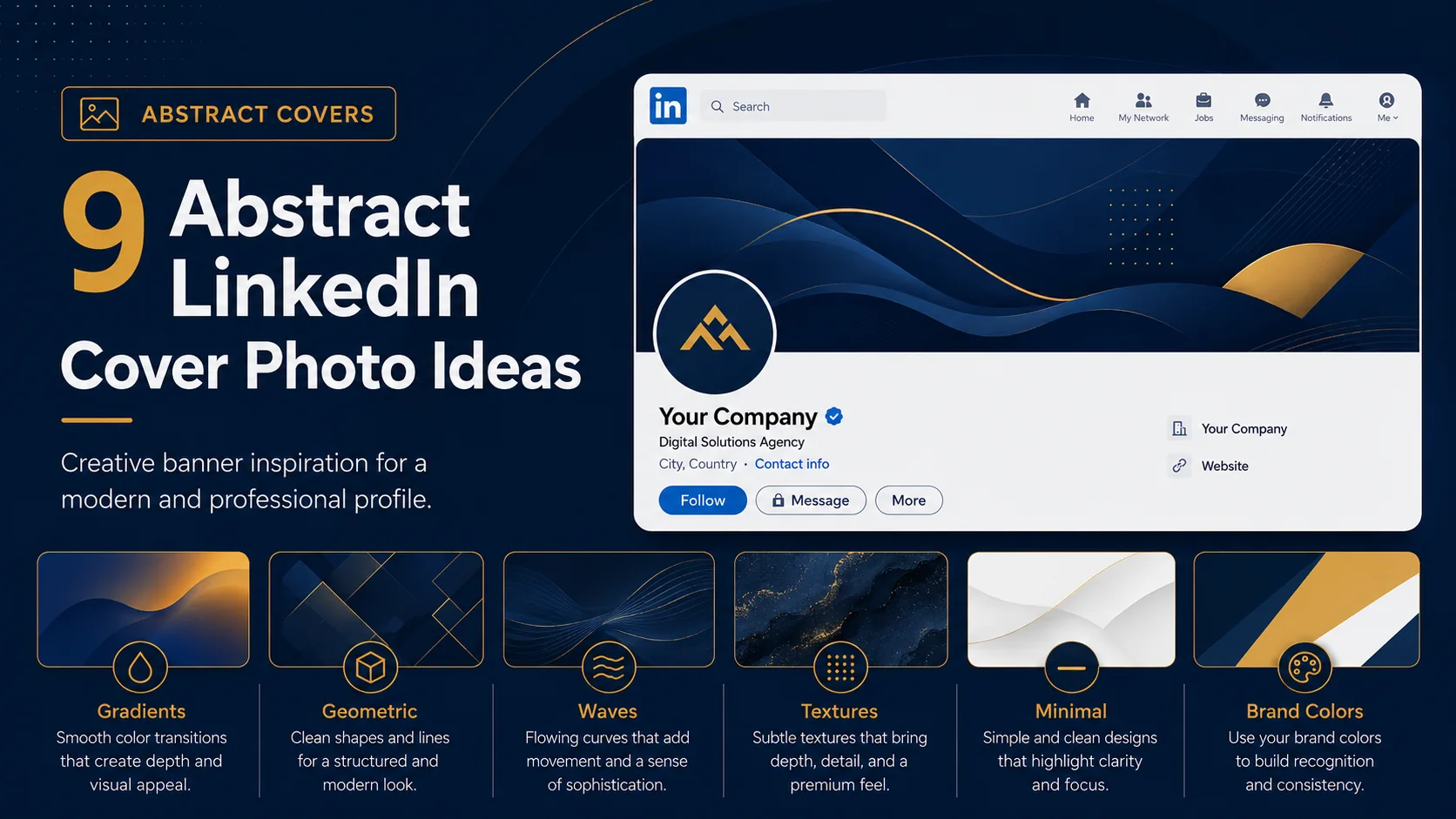
Abstract LinkedIn cover photos are a smart choice when you want your profile to feel modern, creative, and professional without tying the design to one specific place, product, or office photo.
A good abstract banner can use shapes, lines, gradients, textures, or visual patterns to create personality while still keeping the focus on your headline and profile message. This style works especially well for consultants, designers, marketers, founders, coaches, creators, agencies, and anyone who wants a clean branded look.
The key is to avoid choosing an abstract image just because it looks nice. Your banner should still support your personal brand. It should match your colors, keep text readable, and make your profile feel intentional.
Quick ideas in this guide
Before you choose a LinkedIn cover photo style
Before picking any visual direction, think about what you want your LinkedIn profile to communicate. A banner should not only look attractive. It should help visitors understand your personality, industry, value, or brand position quickly. The best designs usually have one clear message, strong spacing, readable text, and a visual style that matches the rest of the profile.
1. Soft gradient shapes
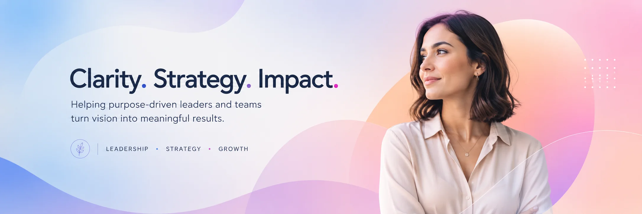
A soft gradient background is one of the easiest ways to make your LinkedIn banner look modern without making it too busy. Use two or three brand colors that blend smoothly, then place your main headline in a clear area. This works well for personal brands, consultants, coaches, and service providers who want a polished profile that feels calm and premium.
Design tip: Use a dark-to-light gradient if you want white text to stand out. Keep the brightest area away from your main headline.
2. Geometric line patterns
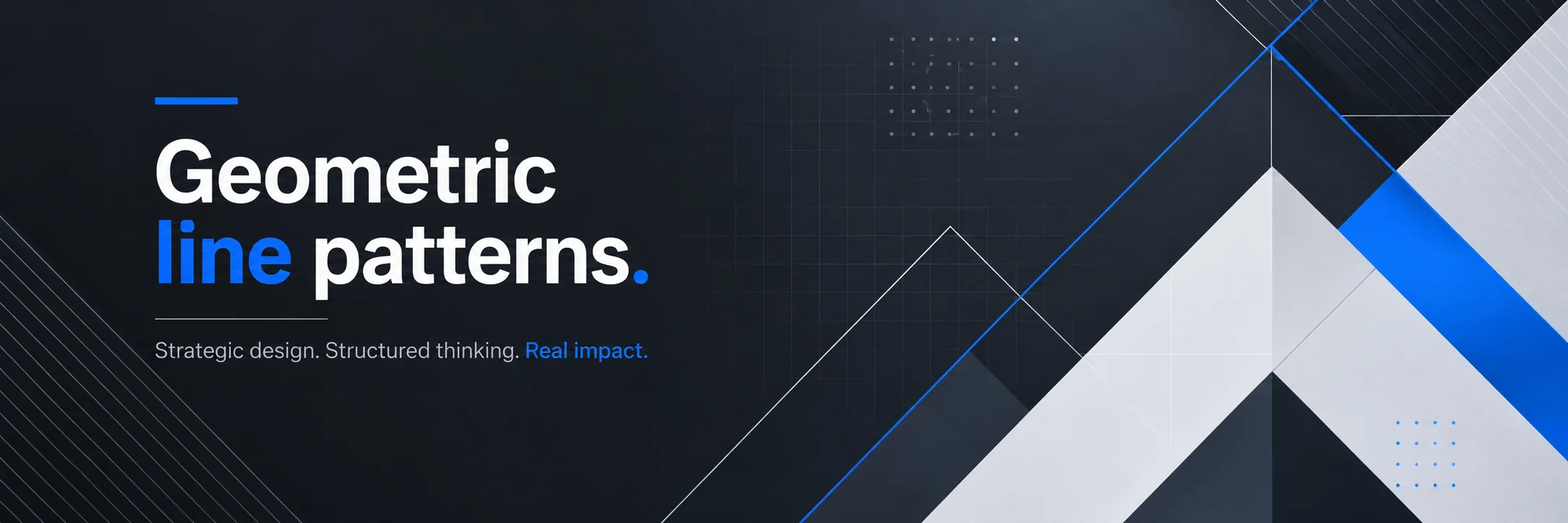
Geometric lines can make a profile feel structured, strategic, and professional. Thin lines, grids, frames, or angled shapes work well for people in business strategy, design, finance, technology, or project management. The design should feel organized, not chaotic.
Design tip: Use thin gold, white, or blue lines over a dark background for a premium look.
3. Minimal wave design
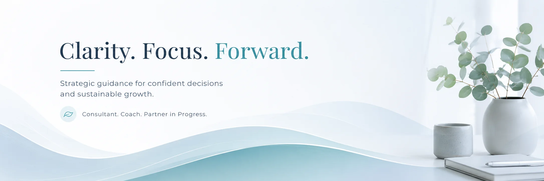
Wave shapes create movement without looking aggressive. They are a good choice for coaches, wellness professionals, consultants, creative freelancers, and brands that want a softer visual identity. A wave design can guide the eye from your profile photo area toward your headline.
Design tip: Keep the wave shape subtle and use it as a supporting element, not the main subject.
4. Dark luxury abstract background
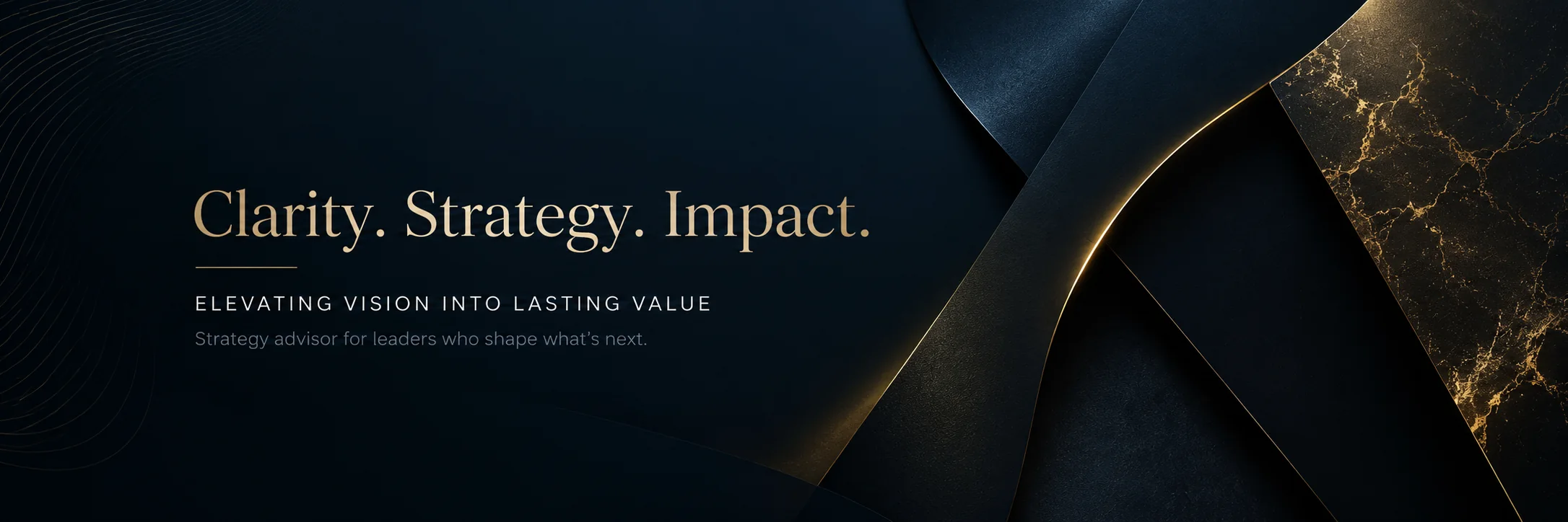
A dark navy or black abstract background with gold or white accents can make your LinkedIn profile feel high-end. This works well for executives, consultants, premium service providers, and business owners who want a more serious look.
Design tip: Pair the dark background with a short headline and a small website URL or CTA.
5. Subtle 3D shapes
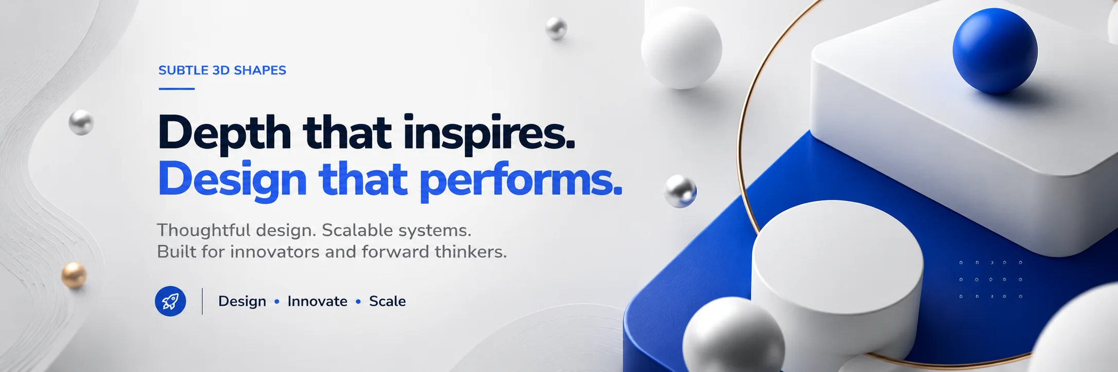
Floating 3D objects, soft spheres, or layered blocks can add depth to your banner. This style is useful for creative professionals, SaaS founders, designers, and innovation-focused brands. The trick is to keep the 3D elements away from the text so they do not compete with the message.
Design tip: Use one or two 3D elements only. Too many can make the banner look like a random stock graphic.
6. Abstract brand color layout
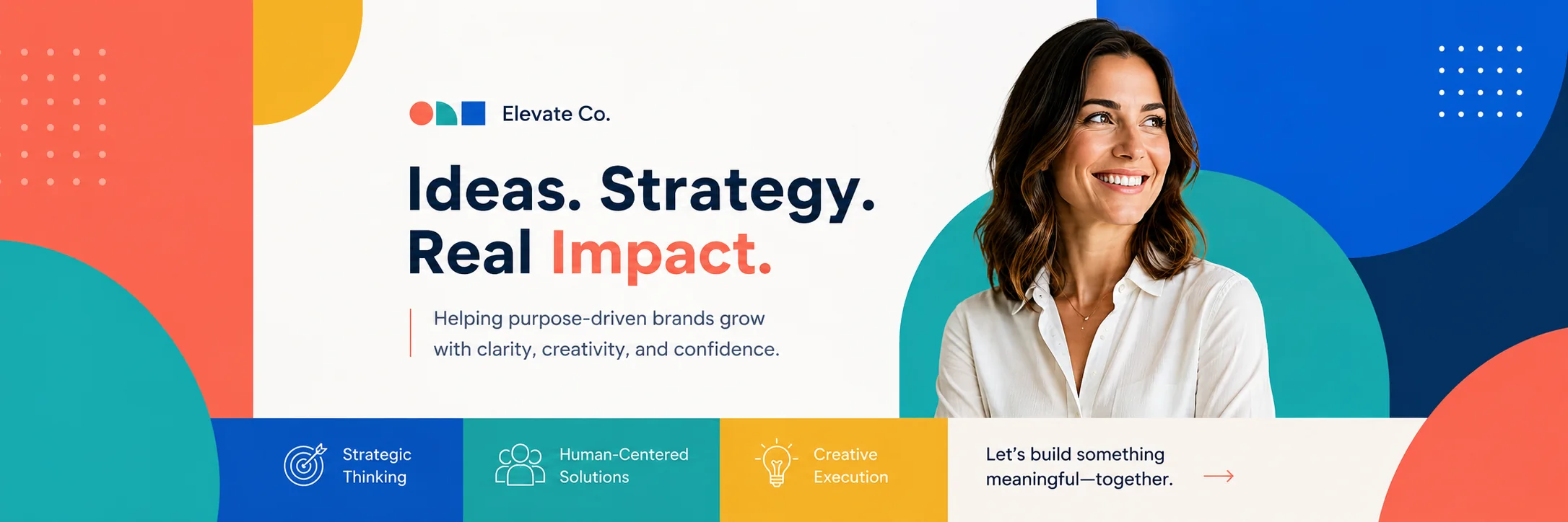
Instead of using a generic abstract image, build the design around your own brand colors. This makes the banner feel more connected to your website, logo, and other marketing assets. A simple layout with branded shapes can look more professional than a complex image.
Design tip: Use your strongest brand color for the accent and keep the background clean.
7. Clean texture background
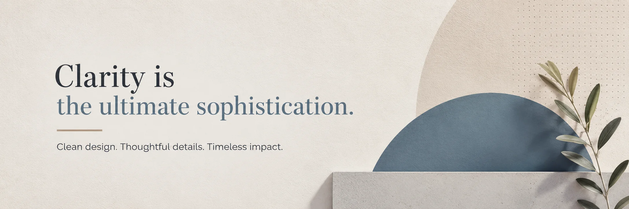
A soft grain texture, dotted pattern, paper texture, or layered blur can make a plain banner feel more designed. This is a good option if you want a simple professional look but do not want a completely flat background.
Design tip: Make sure the texture is low contrast so it does not reduce text readability.
8. Creative icon pattern
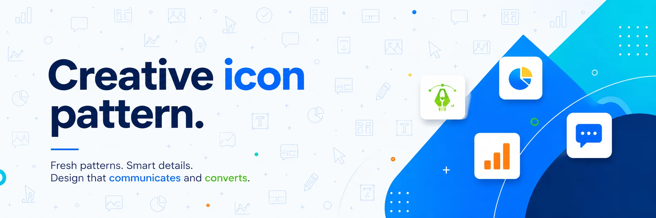
Small abstract icons related to your field can add meaning to your banner. For example, a marketer might use small chart, message, and cursor icons. A designer might use layout, pen, and grid icons. The icons should be subtle and consistent.
Design tip: Use icons as a background pattern, not as the main headline.
9. Abstract frame around your message
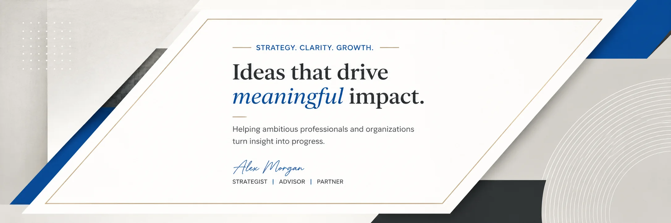
A framed layout can make your headline feel important. Use abstract corners, thin borders, layered shapes, or a semi-transparent panel behind your text. This style works well when you want your message to be the focus of the design.
Design tip: Keep the frame away from the profile image area so it does not get covered.
How to make this style work on LinkedIn
No matter which idea you choose, keep the design simple enough to read at a glance. Avoid placing important text close to the edges because LinkedIn can crop banners differently on desktop and mobile. Use strong contrast between the text and background, and keep your main message short. If you include a logo, website, or call to action, make it secondary to the main headline.
It is also worth checking your banner after uploading it. Open your profile on desktop and mobile to make sure the important parts are still visible. A design can look perfect in a design file but feel too tight once it appears inside LinkedIn.
Final thoughts
Abstract LinkedIn cover photos work best when they feel intentional. The design should not be random decoration. It should support your profile message, match your brand colors, and make your page look more complete.
If you want a cover photo that matches your brand and fits the LinkedIn layout properly, a custom design can help you turn this space into a useful part of your profile instead of leaving it blank or generic.